
SaaS conversion rates are often intricately tied to the quality of the brand’s pricing page. Should they price their product too high or too low, be unclear what different pricing tiers include, or even format it poorly, leads are less likely to convert, even if there is a free trial available.
Designing a high-converting pricing page can (and should) thus involve overcoming the usual conversion obstacles and providing crystal clear information. Do please note that not all of the tactics we’re about to delve into will work for every SaaS product.
A complex combination of different factors needs to be taken into account before you decide which one(s) to implement. Target audience demographics, pain points, competitors, industry, niche, and product type will all, among others, play a significant role in this process.
Take the time to carefully assess each of these tips and examples before you choose an approach that is likely to work best. Don’t make your decision purely on product similarity.
Find the Perfect Balance for Plan Comparisons
The key element of every pricing page is plan comparison. You want it concise and informative, but you also don’t want it to be overwhelming for your leads and cause analysis paralysis.
How much information you will need to provide will depend on the nature of your product, its complexity, and the difference between the features.
Let’s compare two pricing pages. Thankbox has a simple and straightforward pricing page. It shows you two different options you have if this is your first time creating one of their cards, and there are three options available to those who need more than one card.
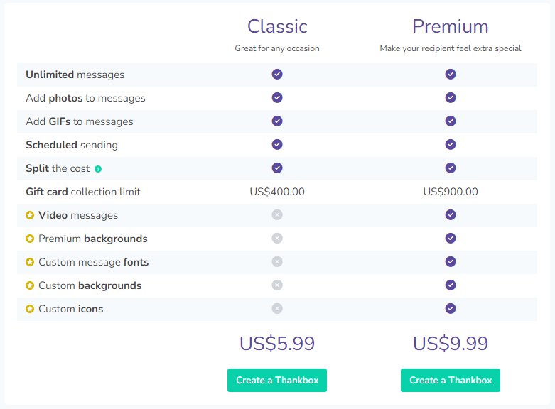
Since the product is easy to understand and use, it would be absolute overkill to add anything further to this page. The FAQ section at the bottom is an added touch that helps visitors better grasp its benefits.
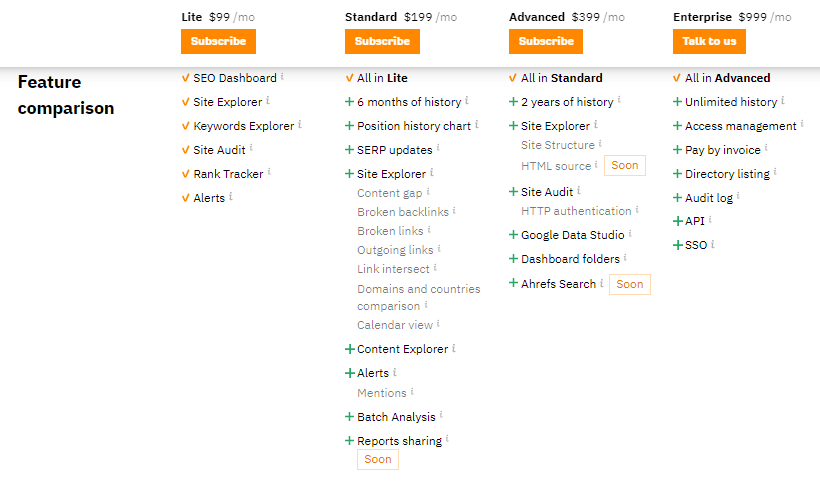
On the other hand, the Ahrefs pricing page is more complex, as it should be. Since it comes with numerous features not everyone will need, the brand has added little pop-ups to explain what each feature does and what it can be used for. There are also countless further resources to explore, just in case you need more information to make your decision.
Address Common Conversion Obstacles Head-On
Ideally, your pricing page needs to do what it can to overcome the most common conversion obstacles your audience is likely to have. This is especially important in the B2C market, where buyers will be much more risk-averse and savings-oriented.
By addressing these obstacles on the pricing page, you are saving your leads time and effort. They won’t need to browse other pages and discover if your solution is worth it.
What said obstacles are will again depend on the nature of your product. It could be your return policy, quality assurance, customer support quality, etc.
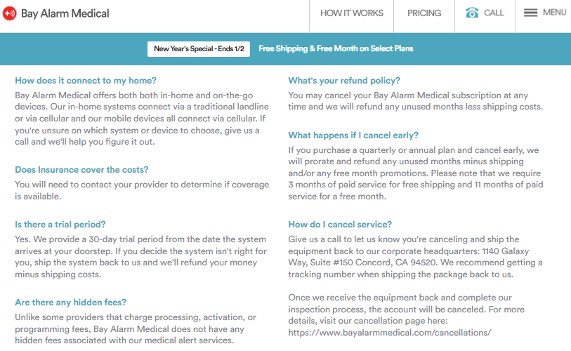
Let’s take a look at Bay Alarm Medical. Below their product comparison charts, they’ve taken the time to address all the most likely concerns: money-back guarantee, different app features, hidden fees, and cancellation policies.
Similarly, you can design several different elements that will address what is most important to your specific target audience. Take a look at what your competitors are doing and try to incorporate what they have omitted to mention.
Your CTAs Are (Very) Important
CTAs play a huge role in pricing pages, even though it may not seem like it. After all, this is a pricing page — one would think it’s clear that there is some sort of commitment involved.
There is, however, a marked difference between low-commitment and high-commitment CTAs. The latter may feel pressuring and have an adverse effect on your leads, who may not be as ready to commit as you’d like them to. On the other hand, low-commitment CTAs will usually seem semi-pressuring and will often result in a higher click-through rate.
For instance, “sign up now” is a high-commitment CTA that will dial up the pressure with the use of urgency words. On the other hand, “start free trial” is a low-commitment CTA that still leaves plenty of room for a lead to back out.
Note that neither of these options is inherently better than the other. Based on your knowledge of your sales cycle and what your leads are more likely to respond to, you can use either or both. Ideally, you want to A/B test various options until you land on the one that works best for a specific audience segment. This may even mean designing different pricing pages for different types of users.
Take a look at Aura. They’ve chosen a low-commitment CTA, “start free trial.” It works for them because their audience will want to see what the product can do before they commit. This is the best choice, given the nature of their solution.
Don’t Underestimate the Importance of Design
Your pricing page also needs to look good. All of your efforts will have been in vain if your pricing page is cluttered, difficult to navigate, lacking negative space, scarcely legible, loading slowly on small screens, etc.
All of the usual design best practices apply. You want the white space, the splash of color, the different font sizes and weights, and the symmetry. Optimize for mobile and ensure loading times are fast and reliable. Last but not least, defer certain elements of the page and preload others.
A mockup generator is vital for visualizing your pricing page design, providing a tangible preview of the layout and aesthetics. It enhances communication, identifies flaws early on, and streamlines the development process, resulting in a user-friendly and visually appealing website.
Github offers a great example of a complex yet well-designed pricing page. While it is very, very long, it comes with a summary at the top that serves as a TL;DR. The juxtaposition of the white and the gray makes the transitions smooth, and the pop of blue draws the eye where the brand wants it to land first.
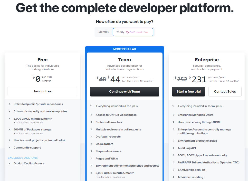
They’ve also cleverly slid a testimonials section between the summary and the full-blown features list. This tiny bit of social proof helps set up positive associations before you start poring over all the minute details of each plan.
Be Clear About Your Features
Your pricing page also needs to clearly spell out all the different features your product comes with in each individual plan. Most brands do this well, but still, you can sometimes come across a page that tells you practically nothing other than that the tiers are geared towards “basic,” “pro,” and “enterprise” users.
Yet again, you need to be mindful of accidentally overwhelming your leads and giving them too many choices. Instead, you want them to understand what they are getting for the price, without asking them to read for more than a minute.
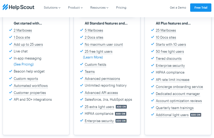
Helpscout’s pricing page is a great example. They’ve used the usual “all X features plus” solution, which has saved them a ton of space. All a lead has to do is read each plan. Once they understand what comes with the cheapest one, they can explore what else they’ll be getting if they choose to upgrade.
This is a great way to structure your pricing plan in general. It provides the clearest possible value for money and supports easy decision-making.
End Prices with 9
One of the oldest sales tricks in the book is ending your prices with 9. You’ve seen it in supermarkets, you’ve seen it in online shops, and while it may seem absurd, it does actually work.
By giving your leads the illusion of a lower price, you can inspire them to convert. Not all SaaS brands do it, though, but they will often price their products at $44 or $37 in an attempt to keep the price interesting.
A brand that does employ the “end it with a 9” tactic is Campaign Monitor. And while we can’t claim that this is the reason behind their high conversion rates, it certainly can’t do any harm.
There is no downside to this tactic, in case you’re worried. It’s just playing a bit of a psychological trick, but your customers won’t feel tricked or bamboozled. They do still take the time to compare your asking price to their perceived value of your product, and a couple of digits won’t send them running.
Anchor Your Prices
Speaking of prices, make sure that you anchor them to further increase your conversion rates. Anchoring means setting certain expectations for your visitors by showing them different prices so they have something to compare. The example often used to illustrate the tactic is how do you sell a $50.000 car? By putting it next to a $150.000 car.
In essence, you are exposing your visitors to a higher price to make them commit to the lower one. Apple uses this tactic often to sell more iPhones, as they leak a high price for their products before they are released. When the true price is revealed, it feels like a bargain compared to what was initially announced.
How do you do this on your own pricing page? Highlight one price as the “most popular” or “recommended” one. This is the package you want people to choose. Put it next to a much more expensive package, which will make your desired option seem like a great deal.
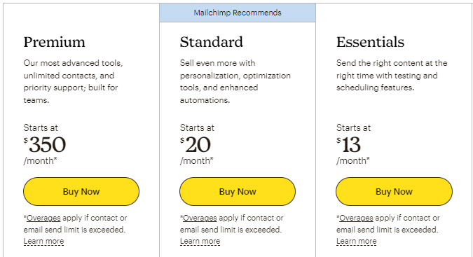
Mailchimp is a prime example of this strategy. Their “Mailchimp Recommends” package is $20, placed between a $350 and a $13 option. Since it’s only slightly higher than the lower tier but significantly lower than the higher one, it is what the majority of their customers will choose.
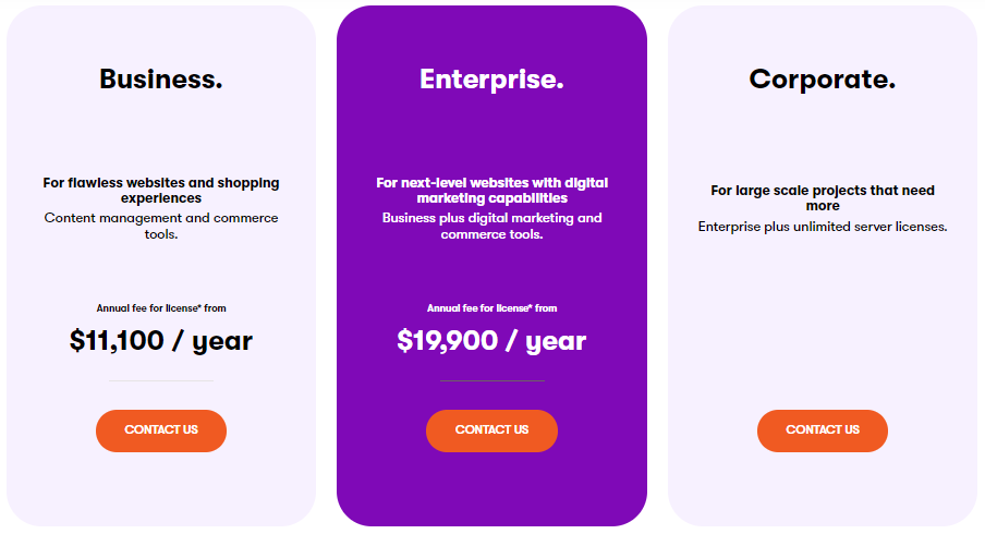
Connect Prices to Audience Segments
Aim to connect your prices with a specific audience segment. Most SaaS brands will label their tiers as “beginner” or “basic,” “pro” or “expert,” and “enterprise.” Or they might use variations of this system.
However, these words don’t actually speak to customers very well. Someone can be an enterprise user who only needs the basic features of your product.
Instead, try to form your prices and features so that they appeal to the specific needs of specific audience members. For example, you can have a package for freelancers — one for in-house marketers in small companies and one for multinationals, depending on your user profiles.
Kentico illustrates this approach perfectly with their three subscription options. Each is named after the type of customer that the plan was designed for: Business, enterprise, and corporate.
Limit the Number of Options
Ideally, you don’t want to offer too many tiers, as they can lead to analysis paralysis and harm your conversion rates. Most companies opt for three choices, which seems to be the best option.
Limiting the choice to just two tiers can be slightly insufficient, and you would probably need to have a significant difference between the two prices. Having one in the middle circumvents this issue.
You can also opt for what is essentially two plans, with the third one available on request. This is what Gatsby does, and their pricing page is among the more interesting ones I’ve come across researching this article.
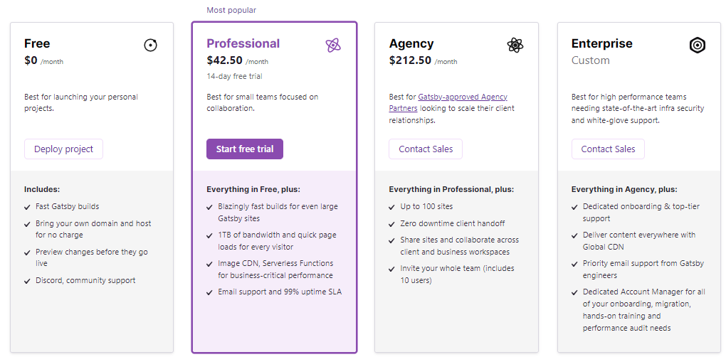
They give you a free option, a basic, affordable option, and a pro option with a high price. They also tell you that you can do even more and customize your needs by getting in touch with their sales team. They’ve done a good job of appealing to all the various tiers of their audience.
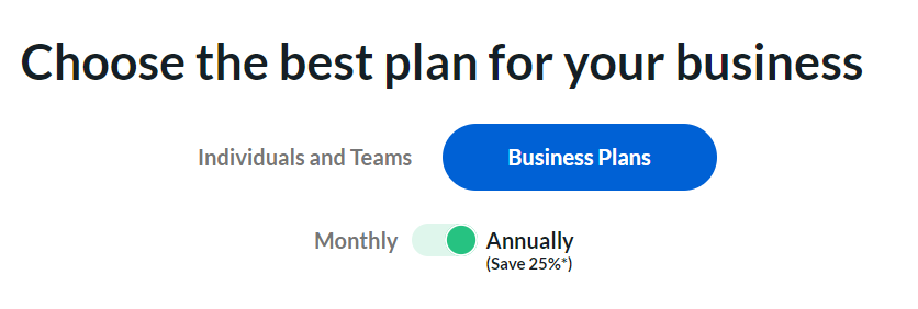
Compare Annual and Monthly Plans
Finally, you also want to give your leads the option to compare monthly and yearly subscription packages.
As a SaaS company, the more yearly subscriptions you have, the better you’ll be able to predict all the important financial metrics that will help you grow your business. Your ultimate goal is to get as many people to shift from free trials to yearly subscriptions (with monthly subscriptions as a cushion between the two).
The way to achieve this goal with your pricing page is to show your visitors how much they will be saving if they sign up for longer. Give them at least a couple of months free with the longer commitment plan.
Your aim is to showcase the value for your customers, and you know they love saving money. If they can pay now and use your solution for the next year and save money in the process, they will give it a think, at the least.
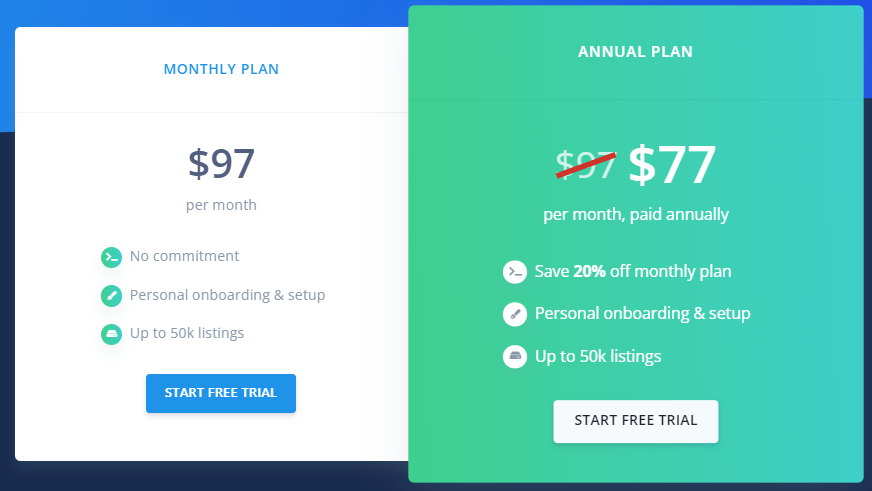
Box has executed this strategy well. When you land on their pricing page, you are shown the annual prices, not the monthly ones. They are also shown as discounted, which is a great price anchoring/displaying the savings tactic.
They’ve also highlighted the fact that you save 25% right next to the toggle button, so there is no confusion and you instantly understand the value.
Compared to this version of the page, the monthly payments page is much less dynamic and more dull. It’s thus less likely to spark conversions too.
Wrapping Up
All of these pricing page design tactics can help you increase your conversion rates and improve user experience. If you analyze them all carefully and take into account all the various factors mentioned in the intro, you will discover the one(s) that will impact your target audience the most.
Featured Image Source: Freepik
PRmention is a digital PR agency for startups & SaaS businesses. Occasionally, we accept high quality contributed content and we’d love to hear any ideas you may have. Feel free to email us on guestcolumn@prmention.com if you are interested in contributing.